
Setting Airbnb up for its next decade of growth
While Airbnb’s Mobile Website was the company’s fastest growing platform, it was also the worst converting. Because it produced less revenue than iOS, MoWeb had been consistently deprioritized. This lack of investment caused the platform to perform worse over time, leading to further deprioritization. This cycle continued until my team showed that Airbnb’s Mobile Website was one of the company’s best opportunities for long-term, sustainable growth.

Challenge
The platform had significant tech and UX debt from years of neglect. However, the biggest challenge was addressing the underlying reasons why the company hadn’t invested more in the MoWeb platform in the first place.

Misconceptions about users
Because native platforms were higher converting, there was a belief that native users were inherently more motivated. As a result, the existing strategy was to encourage MoWeb users to download a native app. In reality, the conversion discrepancy existed because the mobile website was slow and had many UX issues, not because MoWeb users were less motivated. Downloading the app was a high barrier to entry for Guests who traveled infrequently or had smaller devices. We needed to recognize that many more Guests would use Airbnb if they didn’t need to download a 220mb app.
Misaligned incentives
Because native platforms made more money, improvements on those platforms were more likely to help teams hit bookings goals. No team was incentivized to make significant changes to MoWeb. Significant tech debt also made small changes to MoWeb difficult, decreasing the likelihood that improvements would help teams hit goals within quarterly deadlines. As a result, many teams focused on small, iterative tests that optimized for achieving a local maximum. There was little desire to redesign and rebuild a whole platform.
Significant scope
MoWeb had been built as a responsive desktop site. Simply shrinking down the desktop site for mobile led to numerous UX issues. Common elements like typography, buttons, and colors often varied across surfaces. Because teams owned vertical surfaces across the flow, no team was well-positioned to take on a massive end-to-end redesign.
Approach
My team used site traffic data and industry conversion data to demonstrate MoWeb’s potential. The website needed to be redesigned, rebuilt, and optimized as its own platform. Executives agreed, and approved a special task force to improve the site. We were able to borrow top-talent from across the company to work on the project for one year. I was recruited to be one of three full-time designers tasked with reconsidering the MoWeb platform from the ground up.
International research
To start, we needed to better understand the scope of the problem. Our team needed to conduct international research to gain the most relevant insights. In three months, I went on three research trips around the world to help move us through the generative and validation stages so our team could execute quickly and confidently.

November: Generative research in Rio de Janeiro. We chose Brazil because Guests there used smaller devices, had pay-as-you-go data plans, and traveled less frequently. These traits increased the likelihood that users would prefer a fully-functional mobile website over a large native app. In Rio we spoke to users in their homes and uncovered the product areas that needed the most work.
December: Design sprint in Beijing. Chinese consumers use mobile devices for an amazing variety of everyday tasks. My team spent a week with Airbnb’s Beijing Design team generating new ideas to make the MoWeb platform remarkable and innovative.
January: Usability studies in Mexico City. Finally, we held in-lab usability studies in Mexico City to evaluate, refine, and validate our initial concepts. I built all of the team’s research prototypes, making rapid adjustments between sessions to help refine our learnings.
A simpler, unified Checkout flow
Our global research revealed that the checkout flow—which generates all of Airbnb’s revenue—was particularly challenging for Guests. I introduced new patterns, leveraged mobile-specific technology, and created a multi-stage testing plan to improve how Guests booked homes.
Integrated sign up: Guests expected to enter personal information during checkout, but the existing “sign up wall” felt like an interruption when Guests were trying to book a reservation. To make Sign Up feel more natural, we reframed providing personal details as simply another step of the booking process. Research showed this made Sign Up feel easier for Guests.
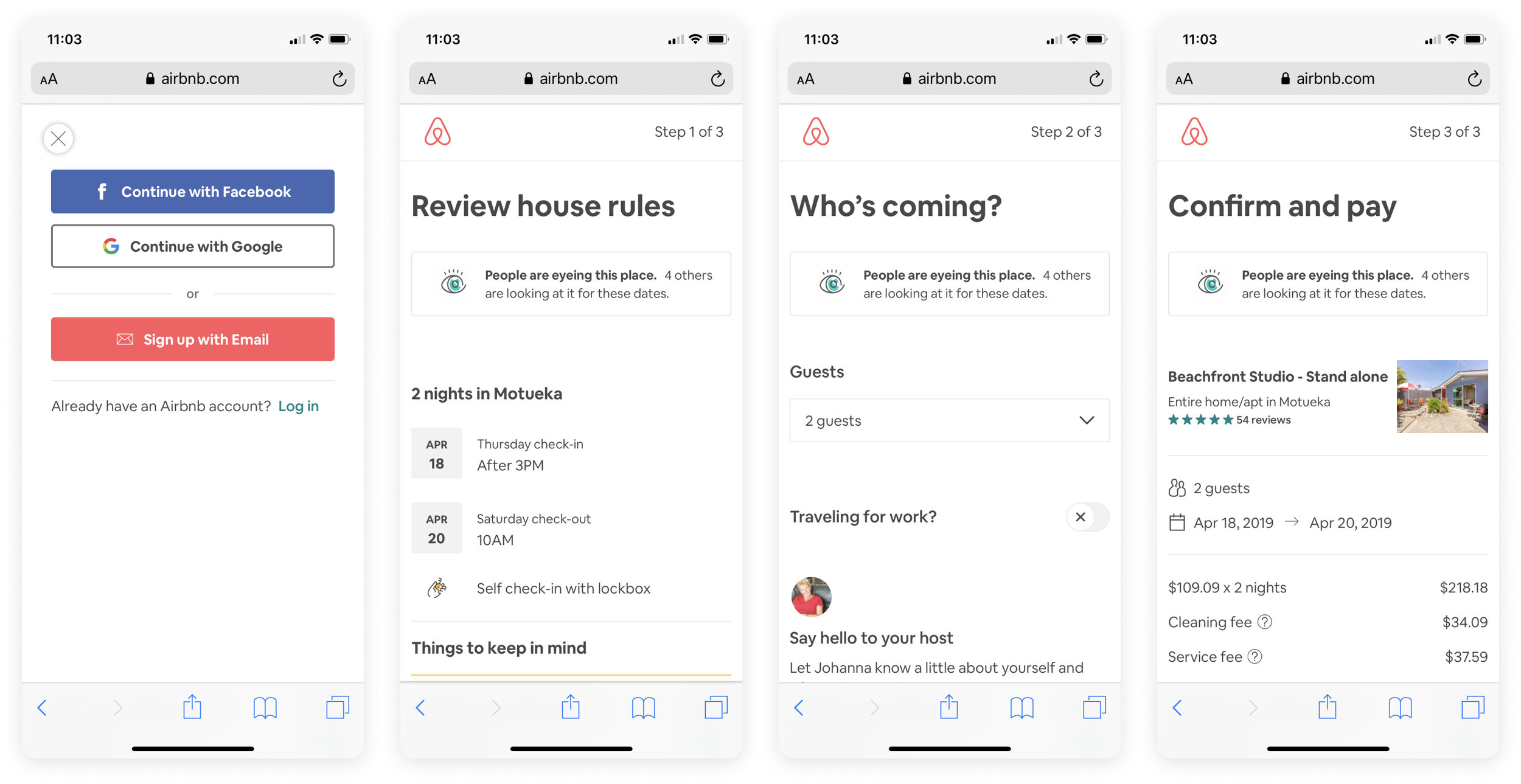
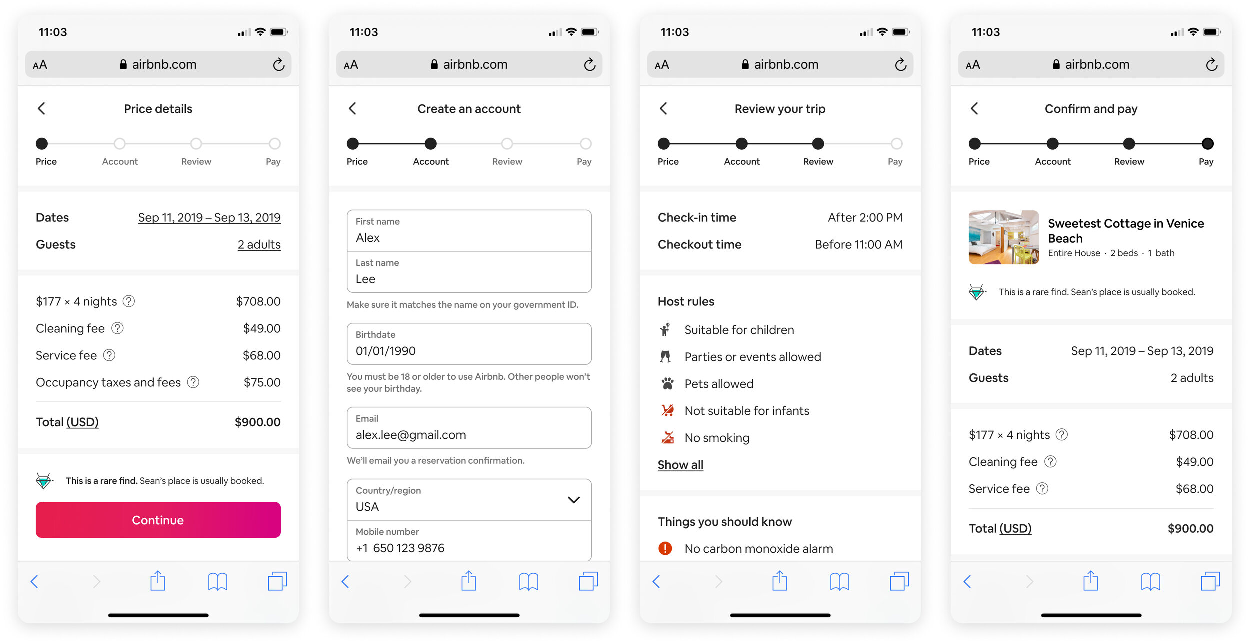
Autocomplete: Some industry-standard tools hadn’t been consistently implemented on Airbnb’s mobile website. In our prototypes, research participants used auto-complete without even thinking about it—a good sign that it was a powerful, accepted, and trusted web convention. Autocomplete was easy to implement and improved usability significantly.
Content sections: A new line-break pattern allowed us to divide long pages into meaningful groups of content, making it easier for Guests to identify important details. This was especially important during Checkout, when Guests were carefully reviewing details to avoid mistakes with their reservation. Unifying the typography and padding of these sections allowed us to reduce the vertical height of some pages by up to 50%.

Visualizing results on the Search page
Knowing the precise location of Homes is important to Guests. It is nice to know where landmarks, entertainment, and shopping are in relationship to the home, but location has significant safety implications in many markets.
Map discoverability: To more easily compare the location of homes, research participants requested a map on the Search Results page. Interestingly, a map already existed here; the entry point on the bottom right corner of the page was simply undiscoverable. To make the map unmistakable, we reserved 50% of the above-the-fold space for a visual map entry point.
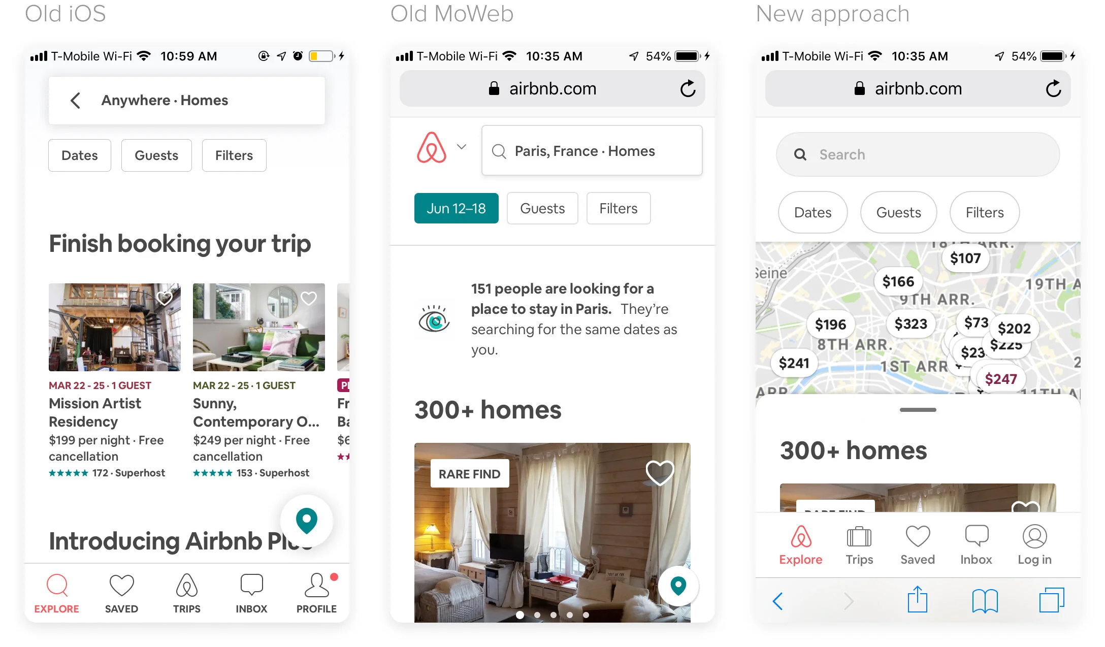
Improved map usability: In addition to making the map more discoverable, we also improved the map itself. Once opened, the new map took over the entire screen. A carousel made it easy to swipe through homes. The smaller carousel tiles allowed for a larger map experience, and worked better on small devices, which are still ubiquitous in emerging markets.

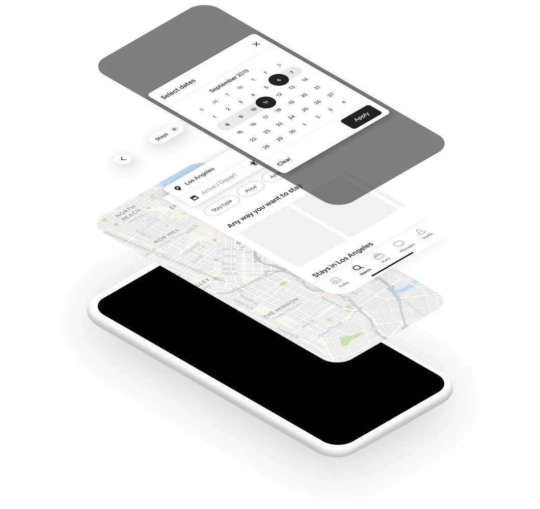
Interaction model: Our most dramatic improvement to the Search page was a new spatial model that introduced additional layers of elevation. The map formed the foundation of the page, with a drawer of search results positioned above. This approach allowed for a larger map entry point, a full-screen map experience, and made the list-to-map transition feel intentional.

Component library
Throughout the MoWeb redesign my team created new components in collaboration with Airbnb’s Design Language System (DLS) team. To ensure other teams adopted the latest MoWeb styles, we created a new source-of-truth library with updated typography, colors, and numerous components for the Explore, Search, Listing, and Checkout surfaces.

Results
Significantly improved bookings
Improving and unifying the end-to-end MoWeb experience had a larger positive impact to bookings than any small, iterative experiment. Gains were especially tangible in markets where users had cheaper devices and traveled less frequently.

The new standard of design
By the end of year-long initiative, our team had made wide-sweeping changes that united dozens of surfaces across the MoWeb product. MoWeb had the most unified product experience at the company, and was considered the new standard of Design at Airbnb. MoWeb patterns were soon adopted by Airbnb’s native products.
Booking: My work to simplify the booking flow spurred the Booking team to engage in an even more aggressive redesign, which I helped lead.
Search Results: The prominent map on the search results page was very successful, and is launching on Airbnb’s native platforms.
Spatial model: Introducing the map as a base layer on MoWeb redefined how layers interacted on Airbnb’s products. This three-level z-space system was adopted and rolled out as part of the official DLS spatial model.
Culture shift
The MoWeb team’s accomplishments demonstrated that bigger bets could be successful and would be supported by executives. This observation spread quickly throughout the Guest organization. Within a few months, many teams had started planning major redesigns of surfaces that had previously only been delicately experimented with.
Better understanding of Guests
Positive research findings from our trips to Brazil and Mexico helped reframe the conversation around Guest motivation. The company realized that users of different platforms had unique product needs, not that they had different motivations.