
Leading six teams to rebuild how all revenue flows into Airbnb
Multiple teams added features to Airbnb’s checkout flow for nearly ten years. Each team optimized for their own goals, leading to a checkout experience that was long, challenging, and frustrating for Guests. For six months I led an effort to improve the checkout flow, achieving results beyond what the company thought was possible.

Challenges
Misaligned incentives
Six teams owned pages and components throughout the checkout flow. Each team worked independently, focused usually on smaller iterative tests that more easily hit metrics goals. There wasn’t much motivation or ability to fix the major tech and UX issues that spanned the entire checkout experience. Making significant improvements would require every team to work together in lockstep towards a shared vision—something we hadn’t done before.
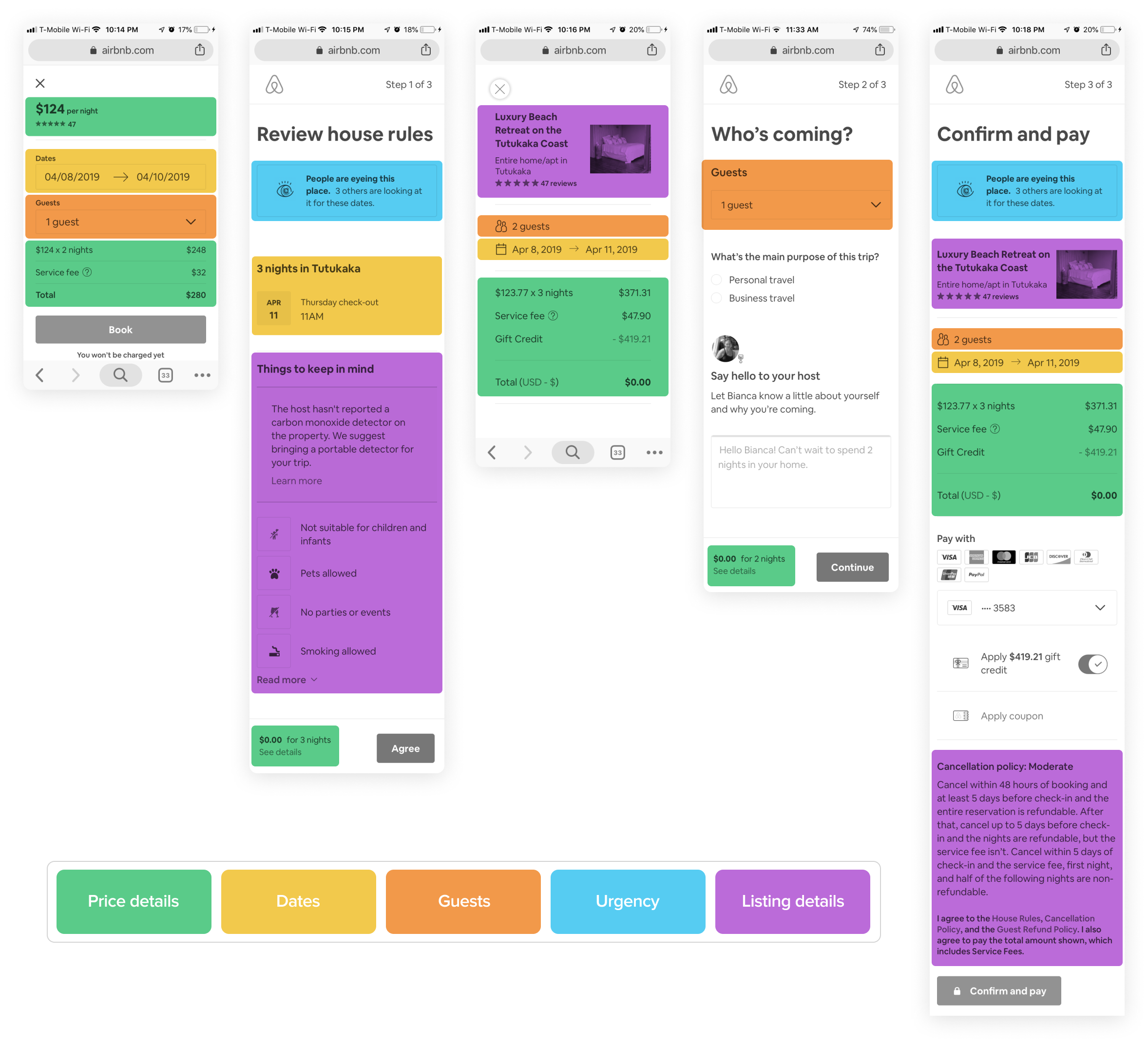
The original checkout flow was long, duplicative, had poor visual design, and was inconsistent between platforms
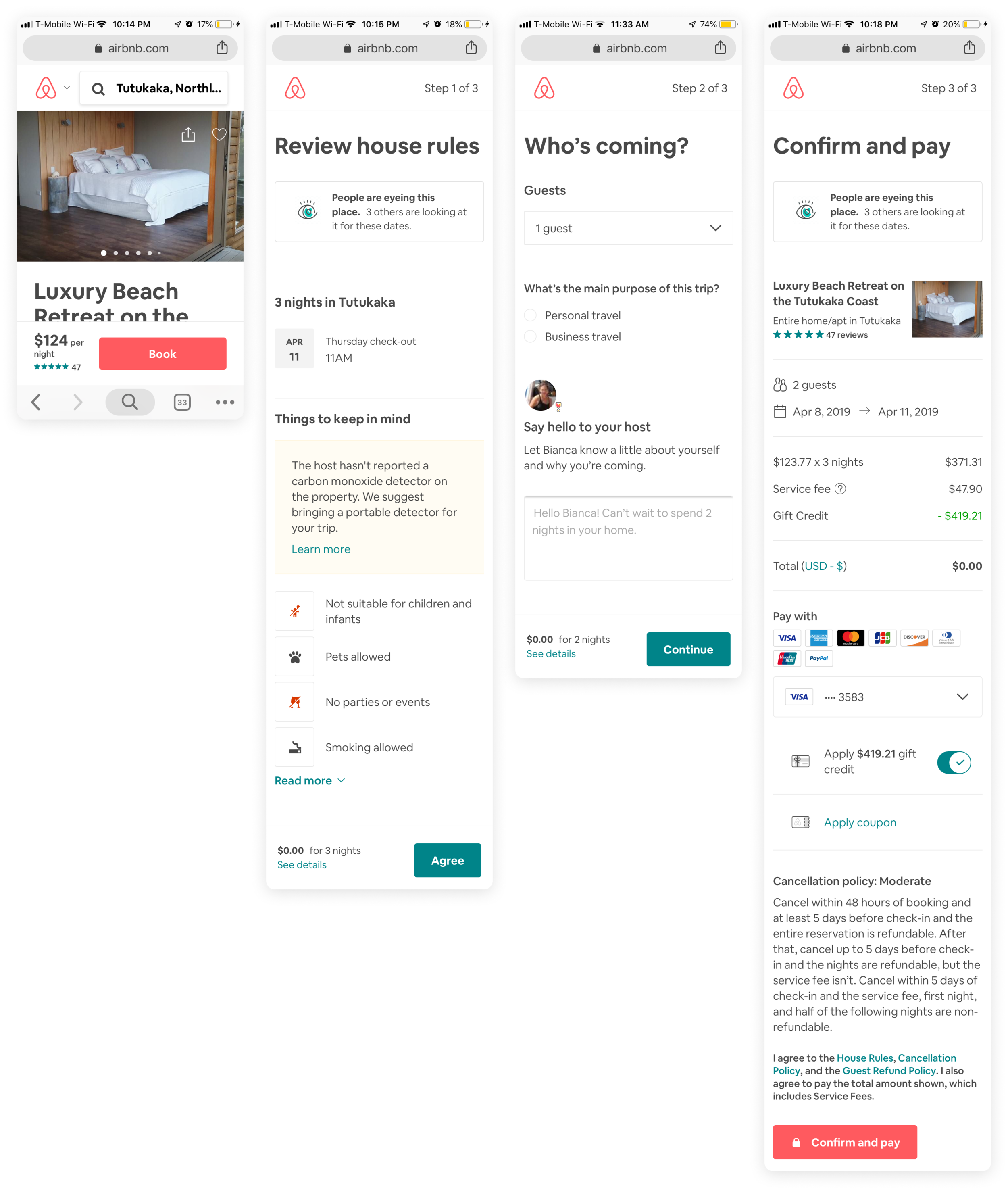
A long, arduous flow
The company thought the checkout flow was the three-step process show above. In reality, the effort required to book a home on Airbnb was far more complex than anyone realized. Visualizing the number of frictions throughout the flow made the problem undeniable, which helped me persuade teams to build a better solution together.
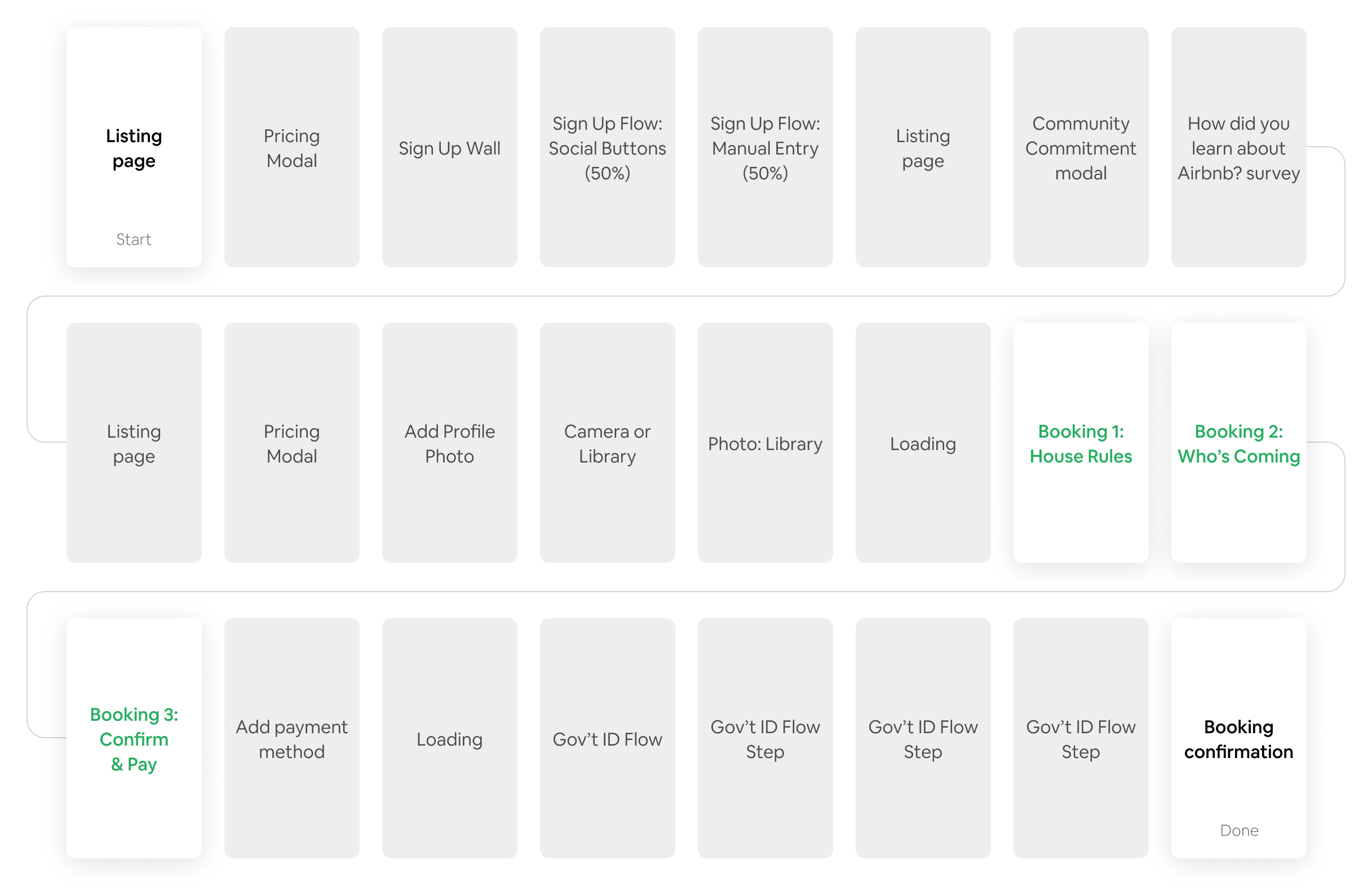
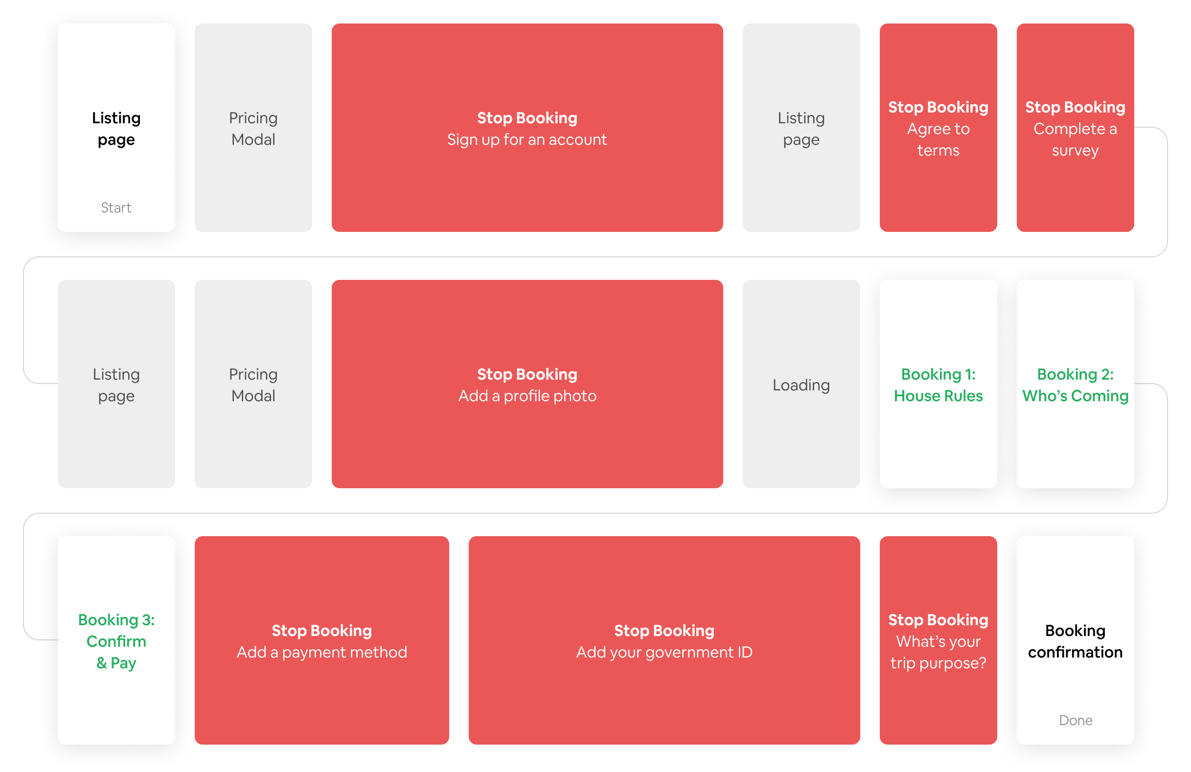
A variable and unpredictable experience
Not only was the checkout flow long, but it could vary dramatically. Different requirements were triggered by complex and unpredictable sets of criteria, so even veteran Airbnb Guests might suddenly encounter tasks they've never seen before:
Account and payment details were needed from new Guests
Profile photo and an introductory message were requested by some Hosts, who wished to learn about the guests booking their home
Passports or visas may be required depending on the country of travel
Government IDs may be needed to verify the identity of some Guests
This unpredictable experience led to a feeling of "perpetual sign-up," where Guests could never really know what they'd need to complete a booking.
Approach
Aligning the teams
We needed to collectively acknowledge problems with the checkout flow, share concerns about a project of this scale, and uncover requirements for finding solutions. My team achieved this through two design sprints. I planned and facilitated a two-hour discussion with 40 design, product, and engineering leaders from each team, which culminated in an intensive two-day design session involving 13 designers. The concepts from this design sprint created the shared principles and goals needed to make the project a success. Several major product ideas from the sprint would reshape not only the Checkout flow, but also Log In and Payments systems.
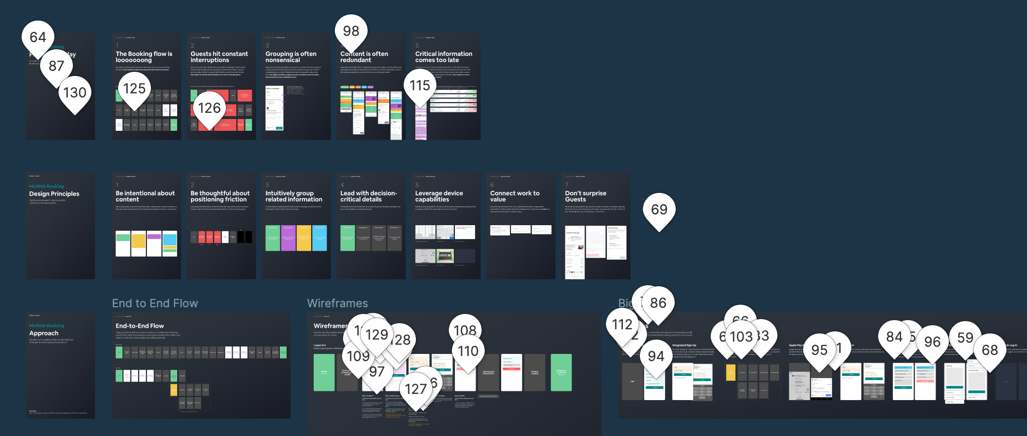
Initial problems, design principles, and product concepts generated a flurry of feedback, which helped me establish collaborative relationships with all teams involved.
Eliminate redundant content & steps
Because checkout was such a high-intent surface, teams had crammed the flow full of content they wanted to ensure Guests would see. Content was regularly copied from other product surfaces, and then duplicated again within the checkout flow itself.
I worked with each team to understand why components were arranged this way. We then worked together to determine which content to eliminate and which content to leave to other product surfaces.
Single page “Hub” experience
Many of the problems of the existing checkout experience—variable length, redundant content, inflexibility—stemmed from using a multi-step flow. As we found ways to eliminate content and steps, a dramatic concept emerged: how might we reduce the five-page flow to a single page?

After exploring several concepts, a “Hub” approach performed best in user research and was preferred by Airbnb’s executives. Instead of a seemingly endless flow, modals could house mini-flows so users could complete all necessary steps without leaving the Checkout page. This set clear expectations up front about what was necessary to book a specific listing.
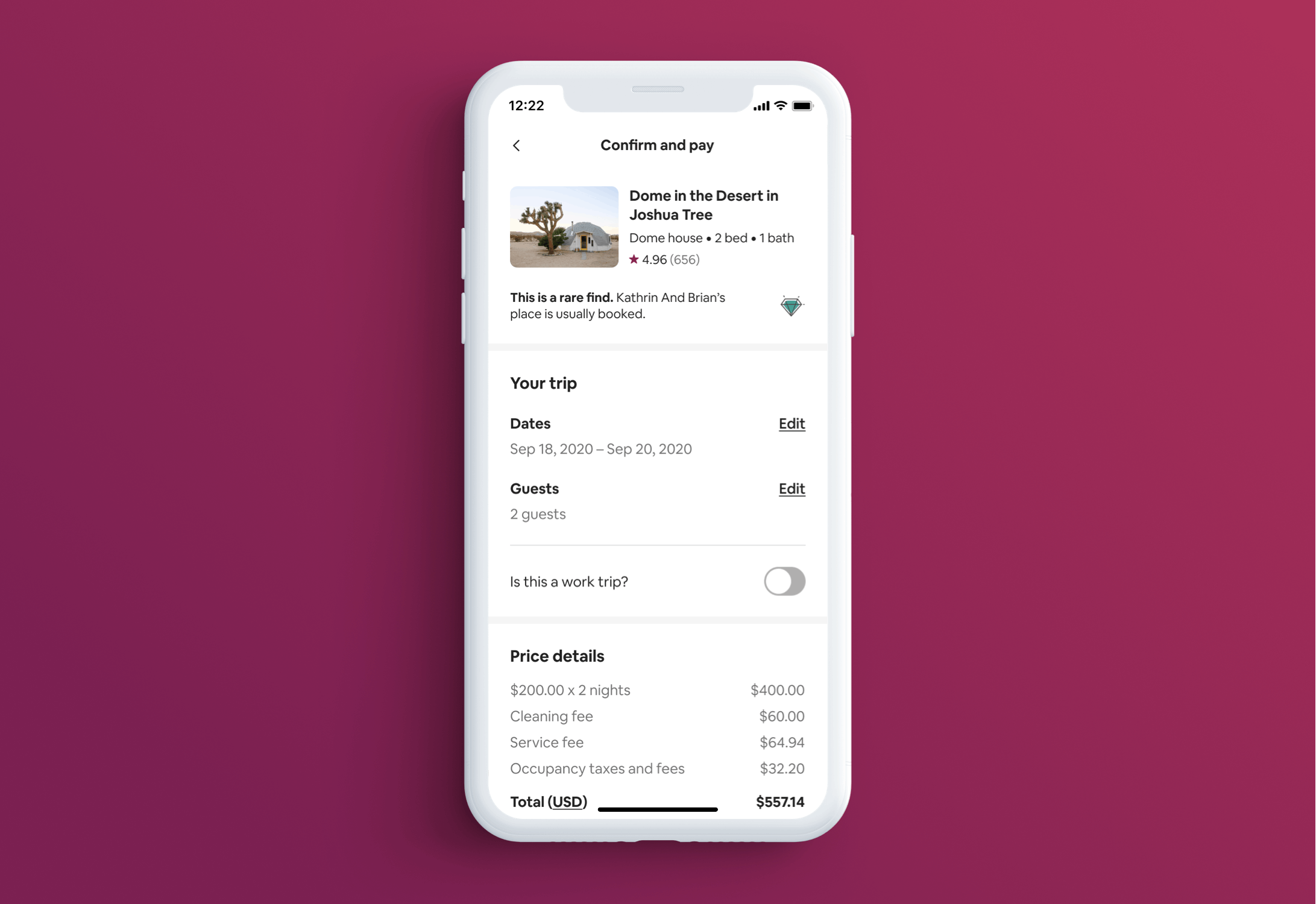
With the Hub model, all tasks and edits could be completed from the Checkout page itself
Adaptable task components
Because the tasks-required-to-book could vary so significantly, we needed a system that could support necessary frictions while maintaining a consistent user experience. We created a modular component that evolved to support any number of required tasks.

New Guests, under most circumstances, only needed to provide a payment method and an introductory message to the host. When no other tasks were necessary, the host message was embedded directly onto the page to make it quickly accessible.
When more tasks were required, we employed a succinct list with clear calls-to-action. Even when a considerable amount of work was required to reserve a listing, research showed that the work didn’t feel as significant because users had a clear picture upfront of what to expect.
The new Hub checkout system was especially beneficial to returning Guests. Instead of going through a flow, returning Guests would instantly reach the Checkout page, complete a quick message to the host, and their reservation would be confirmed.
Results
Dramatically increased bookings
Reducing the old checkout flow to a single checkout page was enormously successful. Small experiments were considered successful if they achieved a 0.5 - 1.0% booking lift. The checkout redesign project was a dramatic step-function improvement that increased bookings far beyond anything the company had been able to accomplish with iterative experiments.
Immediate adoption across Airbnb
The original plan was to build and test the new checkout experience first on Airbnb’s Mobile Website, and deploy to other platforms later. After seeing the results from user research and preliminary experiments, the company moved up its timeframe and rapidly launched the Hub checkout experience for all Home bookings on iOS, Android, and Desktop Web.
The Experiences business vertical, which operates independently and often makes its own product decisions, is also currently in the process of adapting the Hub Checkout model.
Aligning the product across platforms and business verticals was a major accomplishment.
A new way of working
At the start, I knew I’d need to enlist the help of every team for the checkout project to be successful. I worked to make sure that designers, engineers, and product managers who rarely worked together felt like part of one shared effort. This was one of the only times that so many teams have come together to make a dramatic shift to Airbnb’s product. As a result, I was credited with bringing a new level of collaboration to Airbnb.